
Your cart page is where customers review their entire purchase. It’s the online version of a shopping cart (hence the name) and where they confirm their purchase before moving on to payment. Having a well-designed cart page is important for making customers feel comfortable about purchasing and reducing cart abandonment.
But even though a customer reaches the cart page, there’s still a chance to lose the sale. So it’s important to design a cart page that serves their needs and encourages them to move on to the checkout page.
The following are essential elements to have on a cart page. Most ecommerce platforms include many of these elements. If your cart page is lacking any of them, look into third-party apps or extensions.
1. Detailed Product Summary with Images
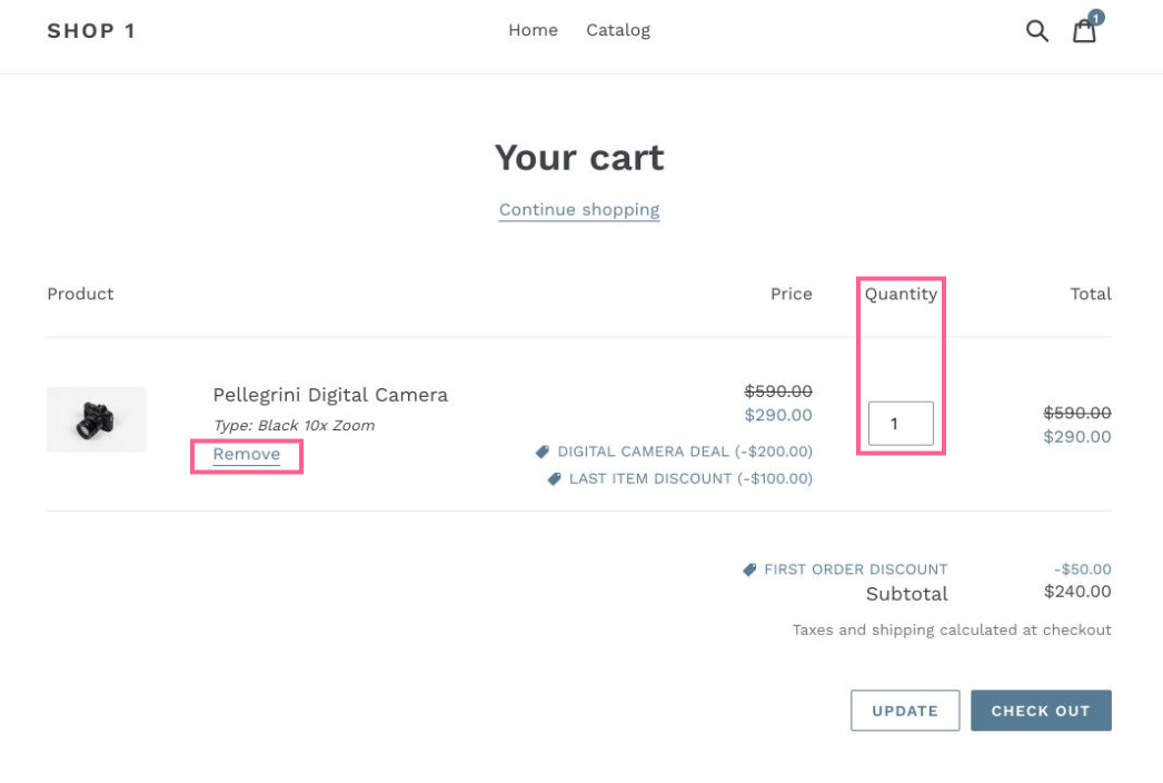
Since your customers use the cart page to review their purchase, it’s imperative that you include a summary of the items in their cart. The customer should be able to quickly view their list of items and confirm that everything is correct.
The product summary should include the following:
- Image of each item (a thumbnail is sufficient)
- Full title of each item, exactly as it appears on the product page
- Variations of the item that the customer selected (such as the color or size)
- Quantities of each item
Your images should be bright and clear. Make sure they are easy to distinguish on mobile devices. Ideally, they should expand when the customer hovers their mouse over them.
Display this information in a clear hierarchy that helps the customer understand it at a glance. Most ecommerce platforms - including Shopify - present the product data in a table so the customer understands which details apply to each item.

2. The Cart’s Subtotal and Total
One survey found that 95.5% of customers expect to see the price and shipping clearly stated. 59% expect to see a "total cost,” which includes taxes, shipping, and any fees.
In fact, hidden costs are the greatest cause of cart abandonment. If the final amount is greater than the customer expects, they’ll suffer “sticker shock” and leave your site. This happens even when the difference between expectation and reality is minimal.
Show the subtotal of the purchase. This is the sum of all of the items in the cart. Then show the final total. This is the sum of the subtotal plus shipping, taxes, and other fees. If your shipping prices are based on location, let customers enter their zip codes so they can get accurate information.
3. Assurances to Reduce Purchase Anxiety
Purchasing online comes with some unavoidable anxiety (especially if this is their first purchase with you). Reassure your customers by including trust signals, notes, and links to information that might make them feel comfortable. Here are some examples:
- Links to your privacy, shipping, warranty, and return policies
- “Money back guarantee,” “satisfaction guarantee,” or “best price guarantee”
- Logos of your partners or affiliates or faces of well-known customers
- Reviews, ratings, or testimonials
4. Primary CTA: Checkout Button
Obviously this is the most important button on the cart page. It should stand out from all of the other elements on the page. Make this button large and colorful. Avoid using contextual words like “Next” or “Continue.” Instead, use meaningful words like “Pay Securely Now” or “Check Out.”
If your cart has a lot of white space, or if a customer has many items in the cart, there’s a chance for the “checkout” button to fall low on the page so it can only be seen if the customer scrolls. Add a duplicate version of this button to the top of the page so it’s visible right away.
5. A “Continue Shopping” Button
A lot of ecommerce sites forget this element, but it’s important. Sometimes your customers visit the cart page in the middle of their journey through your site. They aren’t done shopping, but they want to view what they already plan to buy. For these customers, it’s important to give them a clear route back to your collection and product pages.
The “continue shopping” button is technically a call-to-action, but the page’s primary CTA should be the “checkout” button. So make sure “continue shopping” is less conspicuous.
6. Contact Information
If your customers realize they have questions they need answered before making a purchase, you want to be available right away. If they don’t get the answers they need, they’ll probably abandon the purchase.
Add contact information to your cart page. Include your phone number, email address, and a link to your contact form. A link to your FAQ page helps too.
We also recommend adding a live chat widget to this page. This lets them ask their question and get an answer immediately. No one wants to email or call anymore.
7. Cart Editing Tools
Your product summary should include a few convenient buttons that allow the customer to edit the contents of their cart. We recommend the following features:
- Update quantity - Let the customer add or remove some of each item.
- Remove item - Let them completely remove an item from the cart.
- Add to wishlist - Move the item from the cart to a wishlist for a later purchase. Some wishlist apps even notify customers about their saved items when they return later.
These buttons should be simple, clear, and intuitive. For instance, to remove an item, a customer should be able to click a link that says “remove” or a button with an X.
8. Coupon/Discount Field
If you offer discounts, vouchers, gift certificates, or other promotions, your customers will need a place to insert their codes. Customers will expect it on the cart page so they can see how their discount is applied to their total. 8% of customers abandon the checkout process if they can’t find a coupon code.

That said, keep your coupon box small and out-of-the-way. If a customer has a code, they will look for the box. But to some customers, the presence of a coupon box invites them to go deal hunting. They’ll Google around until they find a code that works. A simple way to handle this is to put a small link on the page that says something like, “Have a coupon code?” leading to a field once clicked.
9. Payment Options
Reassure your customers that you’ll take their favorite payment method by displaying their payment options with icons or logos. If they don’t find a suitable payment option, they will almost always abandon their cart. This is especially important for customers who are only willing to pay one way.

10. Carrots and/or Incentives
If you offer deals that encourage customers to spend more, you’ll want to indicate the cart’s progress toward those offers. For instance, if you offer free shipping if they spend $50, but the cart total is only $43, the customer should see some kind of notification that they’ll get free shipping if they spend $7 more.
11. Cross-sells/Upsells
If a customer reaches the cart page, you should see it as a strong signal that they are willing to buy. So this is the perfect opportunity to offer some upsell and cross-sell options in order to increase your average order value.
For this, you’ll need to install an app that recommends logical products. For instance, it’s logical to recommend a cutting board to someone who’s buying a knife set, but it wouldn’t be reasonable to recommend they purchase a blender. The best upsell/cross-sell apps use analytics to make smart recommendations.
Wrap Up
Now that you understand the essential elements that belong on every cart page, review your shopping cart and make sure it has all of these components. If you are lacking any of them, you may need to install an additional app to get the necessary features. Not sure what to install? Check out our list of the best Shopify conversion apps.Also in News


 and where they confirm their purchase before moving on to payment. Having a well-designed cart page is important ...&media=//www.ultrafade.com/cdn/shop/articles/11_Essential_Elements_to_Have_on_the_Cart_Page_600x.jpg?v=1632486035)


How to Calculate CTR: A Complete Guide for Marketers
Discover how to calculate CTR effectively to enhance your website's user engagement and boost on-site conversions.


Click Rate vs Click Through Rate: Understanding the Metrics That Drive Engagement
Discover the roles of click rate vs click through rate in marketing content, how they measure engagement, and why they are pivotal for campaign success.